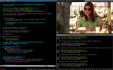
In more established terminology, stacking window managers are distinguished from tiling window managers, but I prefer to think of them as windowing desktops versus tiling desktops. The first type is vastly more widespread. Windowing is the main idea behind all Windows releases (it got slightly fuzzier with the unpopular release 8, but was restored in 8.1 and stays so in version 10). Tiling involves specialised and geeky desktops, but is not really more complicated than windowing, particularly if the user is keyboard-centric, as distinguished from mouse-driven.
The main characteristic that sticks out in windowing desktops (‘stacking window managers’ in more established terminology) is that application windows can be maximised, minimised (‘iconified’ in Linux terminology), and stacked partially above each other. Thus there are layers of placement on the desktop (‘top’ and ‘lowered’) and a mouse-click or cycling keybind (Alt+Tab) will raise a lowered window above others, i.e. to the top layer.
In contrast, a tiling desktop presents application frames (‘windows’) in neatly ordered tiles in a single layer. There’s no lowering or raising, there’s just shifting focus from a tile to another by keybind or mouse. Normally there are no breaks in between the frames, so the space is put to maximum use automatically. Due to a single layer and tight positioning, any resizing and repositioning of a tile affects all other tiles. It is usually inconvenient with a mouse and cannot be done without consideration to the whole layout of the workspace. 
Some notes on the tiling desktop in the image. You may want to fullscreen the video, but this would naturally leave the rest of the tiles behind – which is similar to any windowing desktop. Alternatively, you may want to maximise the text editor window and resize the video smaller in a corner, for example when transcribing from the video, to give maximum space for writing and minimal necessary space to the video. In normal tiling mode, the video tile would always take up a column or row equal to its width or height, but on some tiling desktops there’s a specific ‘floating’ mode that can be assigned to a specific tile. However, the floating tile would always be on top of the rest of the layout – there’s no concept of layers, i.e. raising or lowering.
There’s also no concept of minimising or iconifying in a tiling desktop. You cannot add icons to the desktop to click and you cannot minimise all frames to view the desktop. To view the desktop (the background image or conky or what you may have there), you will need to open up a new fresh desktop space.
On the other hand, creating a maximally useful layout with two apps side by side is extremely easy in a tiling desktop. The classic dual-pane view of two apps side by side (as in comparing documents) is what normally happens in a tiling desktop all by itself when you open up the first app (it comes up maximised) and then the second (the first one resizes to take up half of the workspace and the second one takes up the other half). Very convenient.
When you want more apps open than the workspace can fit, there are easy default keybinds to send the focused tile to another workspace. If you cannot do without the experience of raising and lowering, you absolutely need multiple workspaces in a tiling desktop. Some tiling desktops may feature a ‘scratchpad’ which essentially does the same thing – the equivalent of lowering a window, hiding it from sight without opening another workspace, keeping it open in the background, ready to be recalled by a keybind. Even given a scratchpad, multiple workspaces are an inevitability in tiling desktops.
An additional compensating feature in tiling desktops is the ‘stacking’ or ‘tabbed’ mode. In this mode, the workspace does not create new gradually shrinking tiles when new apps are opened. Instead, every new app opens up maximised. Thus you always face a single maximised frame at a time, and to get to any other app, you switch to another maximised frame. This makes actually pretty good sense on small screens, such as netbooks.
From the user’s point of view, the choice between tiling and windowing first boils down to whether the user prefers mousing or keyboarding. Mousing is much more limited on a tiling desktop. Keyboarding is essential.
Moreover, not all windowing features are easy to re-create on a tiling desktop. For example, I personally began immediately to miss proper cycling, by which I mean switching between all apps without regard to their position on the screen or location on workspaces (Alt+Tab). The tiling desktops I tested preferred to recognise directional cycling, i.e. you have to know whether the app you want is to the left or right or up or down, and the number of workspace where it’s located. So, it’s important to remember where you open up things, perhaps by making workspaces topical, like “Internet” or “Office” or “Games”.
In summary, there are some very interesting features in tiling desktops which may make you switch from a windowing desktop for greater productivity. Or, if not switch, you may discover features that you may want to re-create in your familiar windowing desktop, for example always maximise windows in Openbox. And there’s a link available to a tiling window manager demonstration.
